The proposal
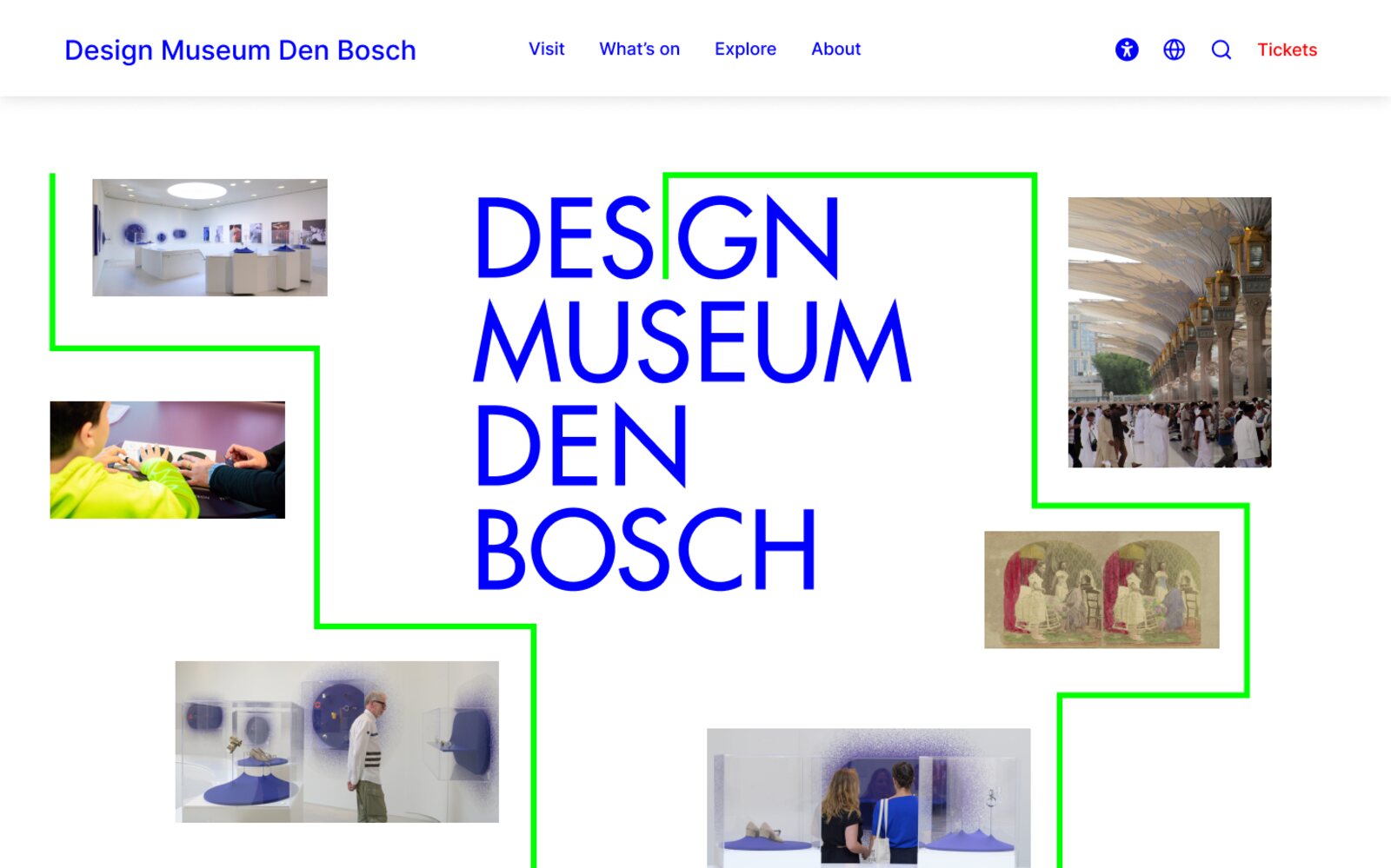
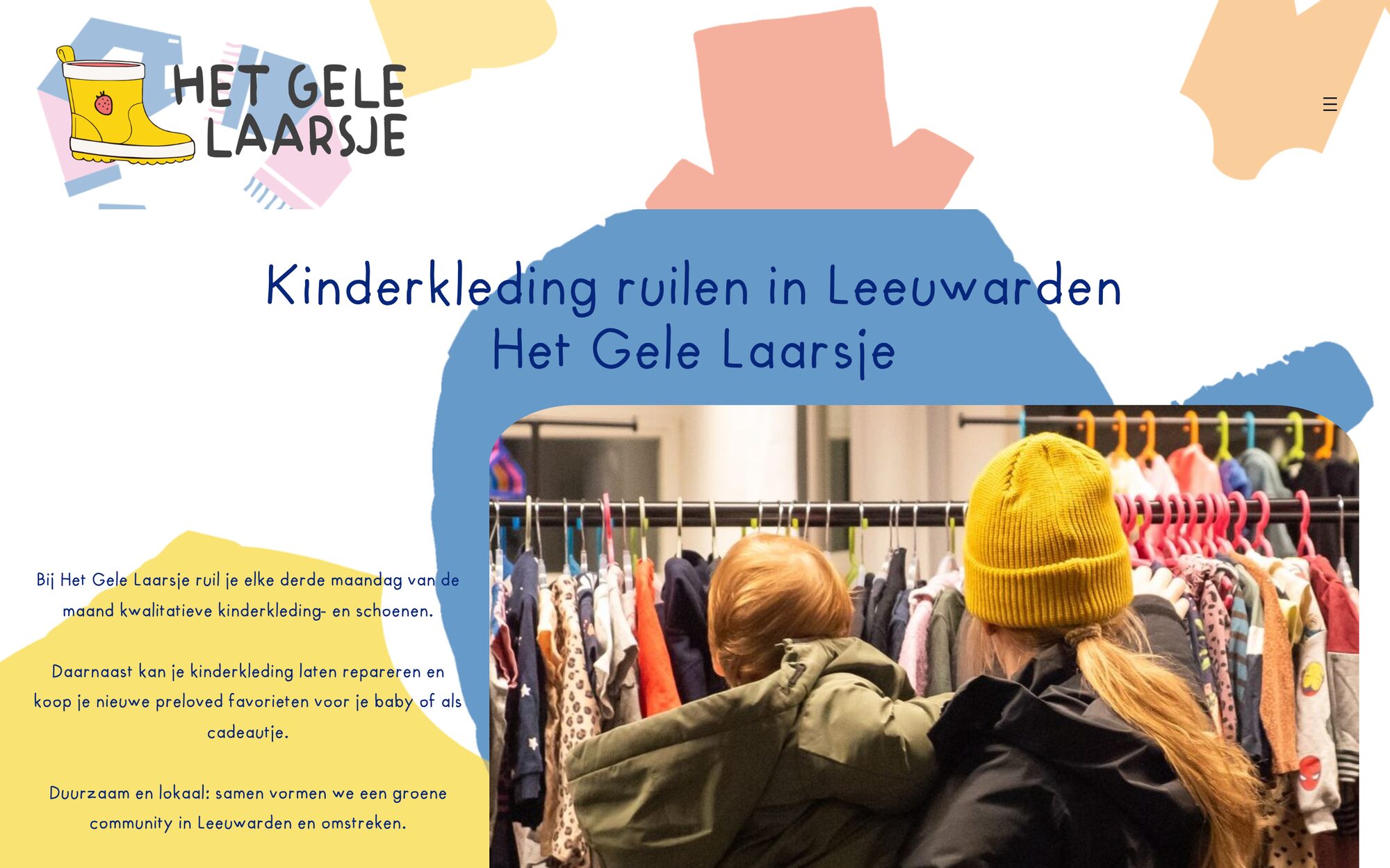
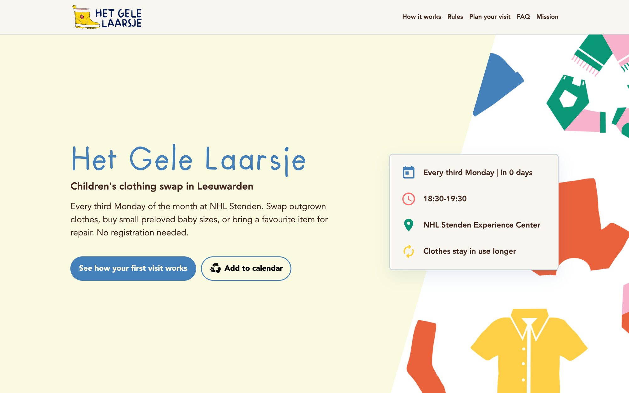
Het Gele Laarsje is a monthly children’s clothes swap in Leeuwarden. Inside a team of six, I researched, designed and built the whole proposal myself.
The client approved the direction and decided against a new website, because she had other problems to solve first. What exists is a complete proposal and a prototype you can click through.
Why it had to be simpler
The organisation’s problem showed up at the events themselves: people arrived confused, and the swap runs on volunteers, on one evening a month.
The old site had the answers, but spread over many pages in long paragraphs, and it already showed the symptoms: the instruction to walk past the queue repeats on three pages, and one question asks where to go once you are inside.
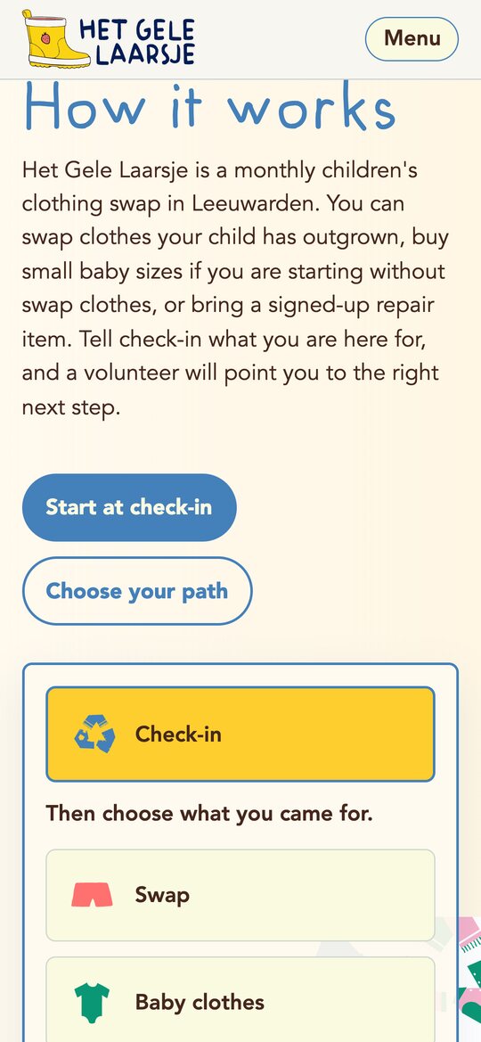
So the proposal is built around one simple first visit. Check-in is the one rule repeated everywhere: tell a volunteer what you came for, and they point you to the next step. Everything else is made to be read at a glance: a path for each reason to come, rules that fit on a card, and questions grouped by the moment you need them.
Nobody should have to understand the whole system before they come.
What changes
The tour above shows the three main pages. These are four more changes, from the rest of the site.
3.1The rules in one place
3.2A mission you can find
3.3Baby clothes, one of three paths
3.4Questions grouped by moment
How it is built
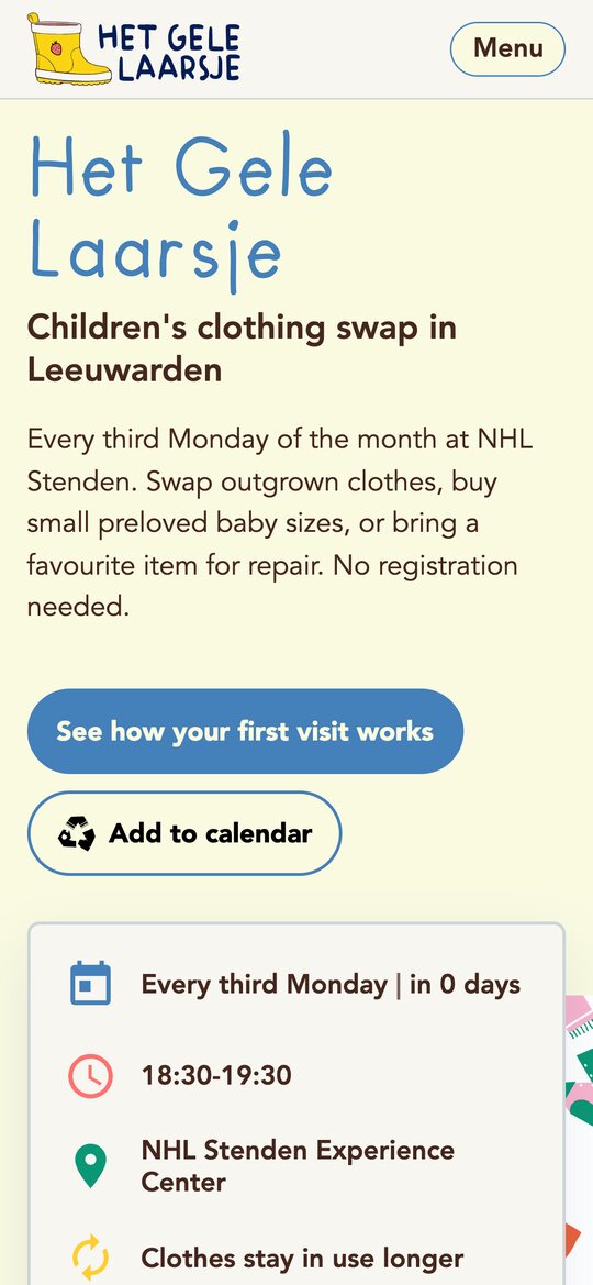
Mobile first
Every page was designed for a phone first, then widened.
What I delivered
- —A content architecture for the whole site.
- —A design direction document.
- —A system of brand tokens.
- —Mobile-first CSS, organised in cascade layers.
- —Copy rules, each backed by a source.
- —A size calculator for parents.
- —The prototype itself, deployed as a static HTML and CSS site.